The Eurovision Song Contest began in 1956. Throughout its almost 70-year history, the contest has taken on many identities, and from 2002 onwards, the winning country has created the concept and design to be used the following year.
Here are some of the most recent brand identities, and the stories behind them.
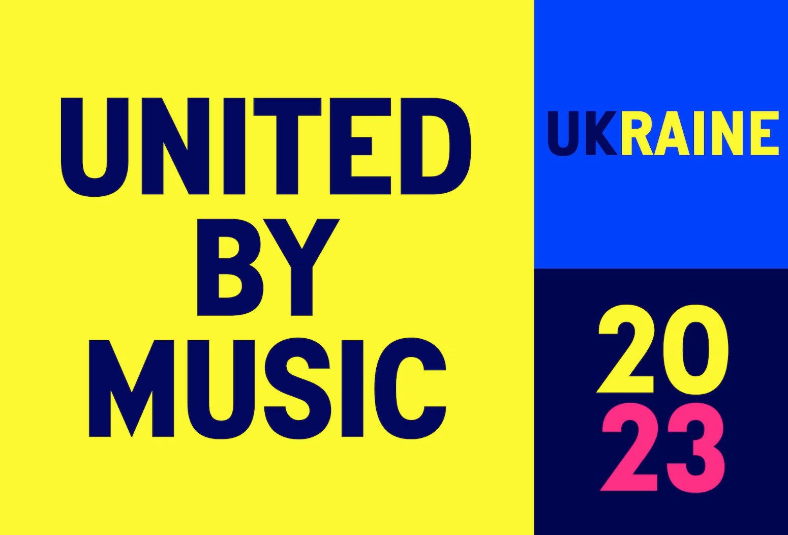
2023
United by Music, Liverpool – UK
The 2023 branding was completed by Superunion (now Design Bridge) and Ukranian agency Starlight Creative.
Unfortunately, the previous year’s winning country Ukraine could not host the 2023 competition due to safety and security reasons. As 2022’s runner-up, the United Kingdom took the reins, and Eurovision 2023 is being hosted in Liverpool instead.
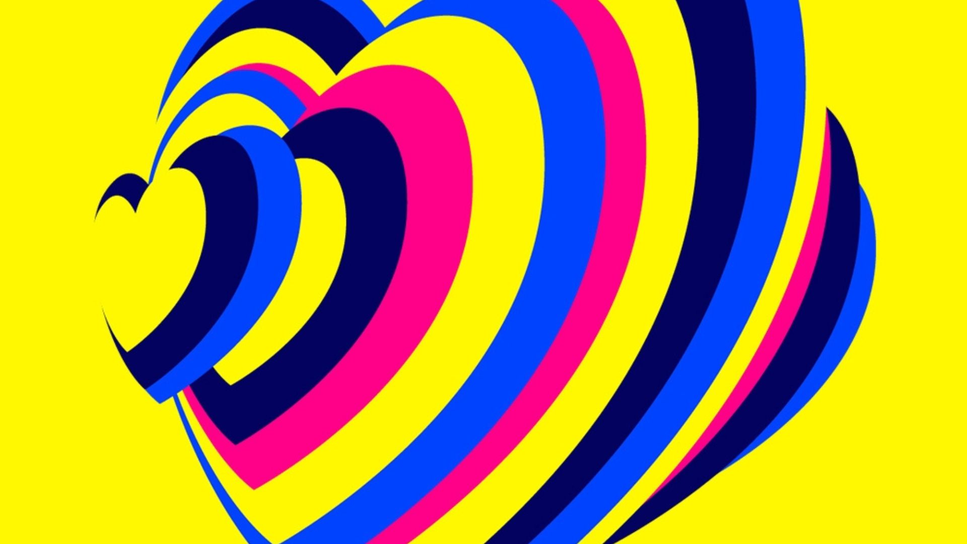
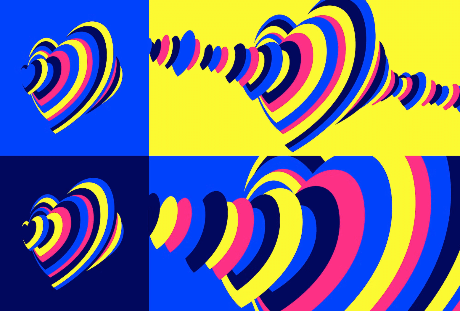
2023’s Eurovision brand identity considers this, incorporating Ukraine’s national colours, blue and yellow, into its brand identity, whilst sporting the tagline “United by Music”. This is a way of showing the UK and Ukraine coming together as one.
The agencies discovered research showing that when people listen to music together, their heartbeats synchronise. The “heartbeat soundwave” represents this beautifully, as the hero graphic of 2023’s competition. “The idea of 160 million hearts beating as one was a powerful yet simple thought”, said Superunion’s Stuart Bradford.
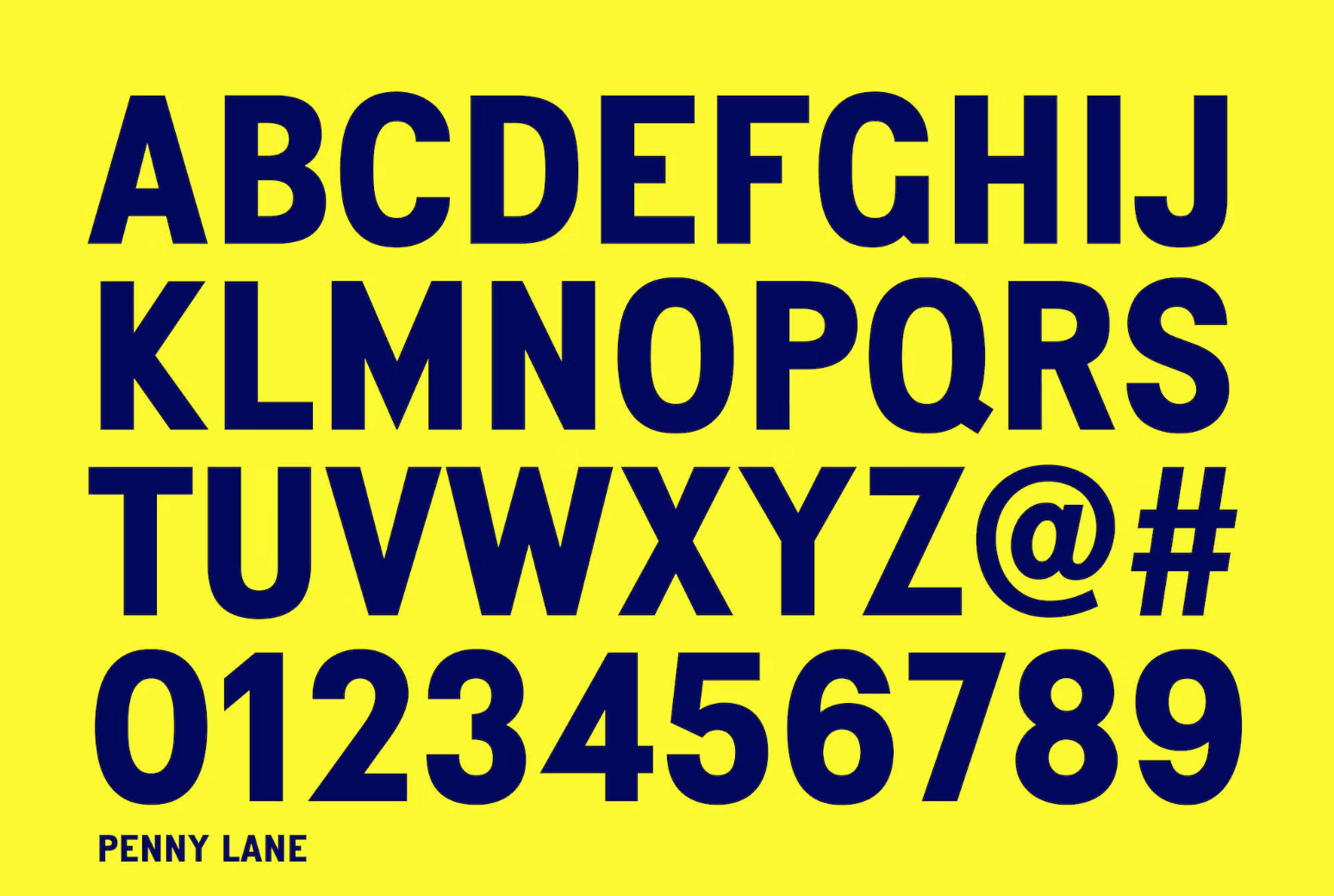
The typeface used is Liverpool-born Keith Bates’ Penny Lane, which is a sans serif derived from twentieth-century cast-iron signs displaying Liverpool street names. Using this typeface brilliantly ties in the City of Liverpool to this year’s branding.
 2022
2022
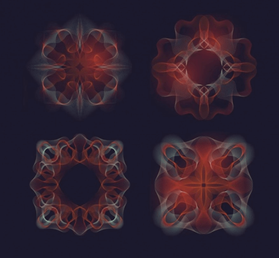
The Sound Of Beauty – Turin, Italy
The 2022 Eurovision brand identity was created by Floppico Design Studio, based in Rome.
The theme was The Sound of Beauty, drawing on cymatics. Cymatics is the science of turning sounds into patterns which appear as geometric shapes. This lent itself perfectly to the overarching concept of the Eurovision song contest, which is of course music.
Floppico used the shapes created by sound to inspire the designs and applications across social media, on- and off- air promotion/broadcasting, and for use within motion graphics.
The moving element of the brand identity tied well into cymatics. Shapes are created when sand or other substances vibrate on a plate, transforming depending on the frequency of the sound. This was incorporated into the transitions from one shape to another at various points in the broadcast.
Interestingly, cymatics were also used in the intro to The Lord of The Rings: Rings of Power.
The term “cymatics” was coined by Swiss physician Hans Jenny, and is demonstrated in the video to the left (or below, if you’re watching on a mobile device).
Accompanying the overall brand concept is the Italian typography style, inspired by Italian poster designs. The typeface ‘Arsenica’, a serif typeface designed by Francesco Canovaro for Zetafonts, is used throughout the identity, in varying weights.
Symmetrical Italian garden compositions called “Giardini all’Italiana” inspired other elements of the identity, including the set design. Looking at these garden designs, it’s clear they share the same patterns and visual style as the shapes and images created by sound waves.
Together, these concepts tied together created a cohesive, quintessentially Italian brand identity.
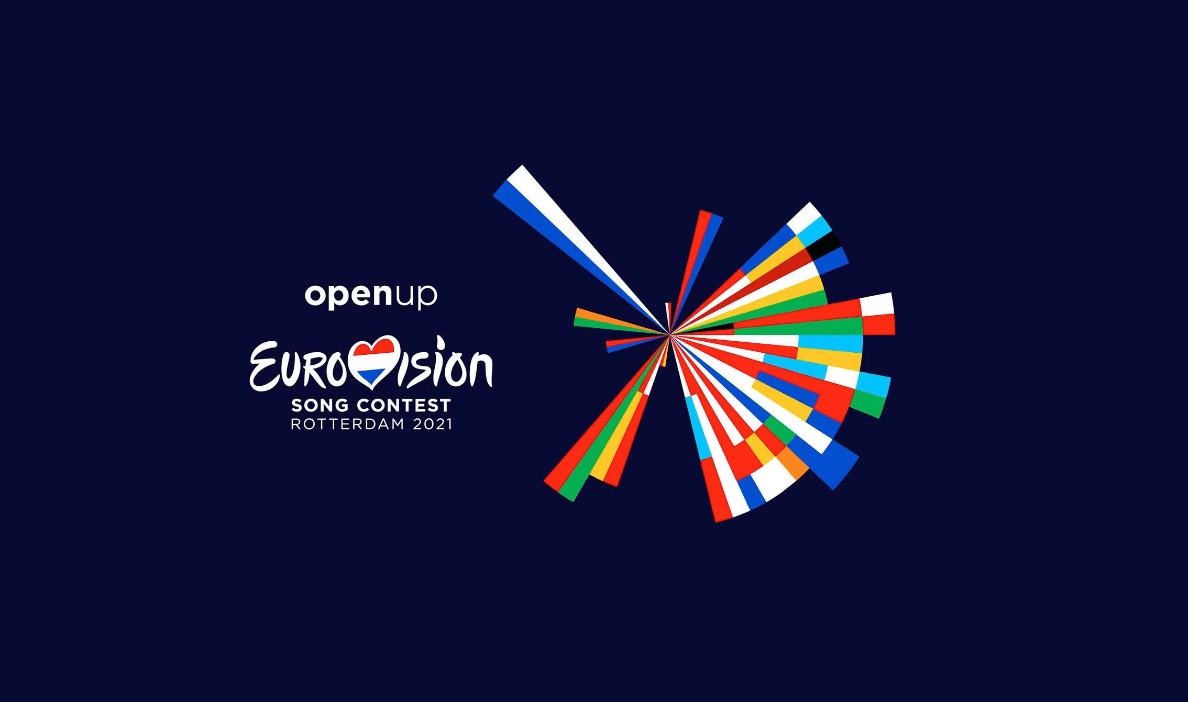
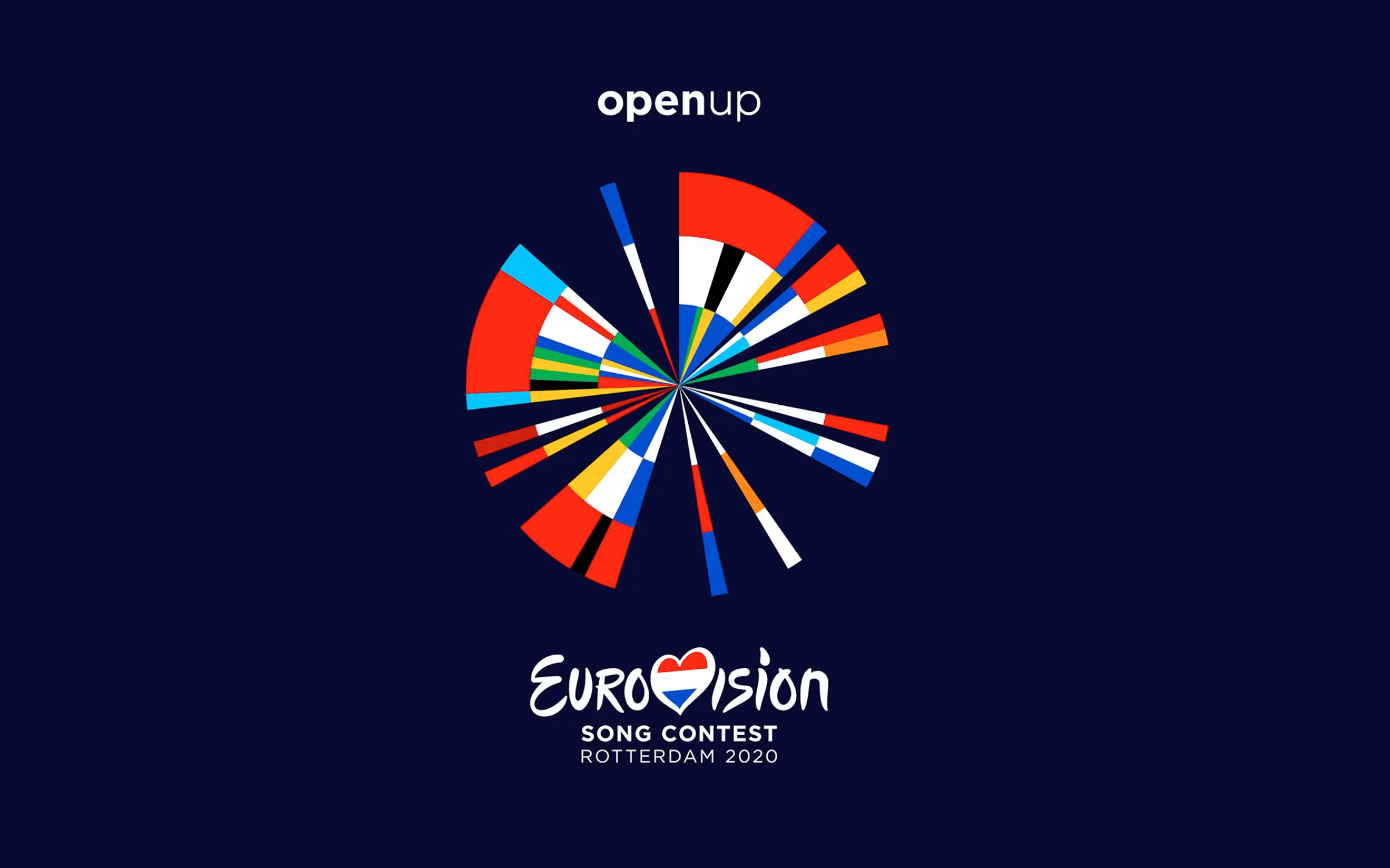
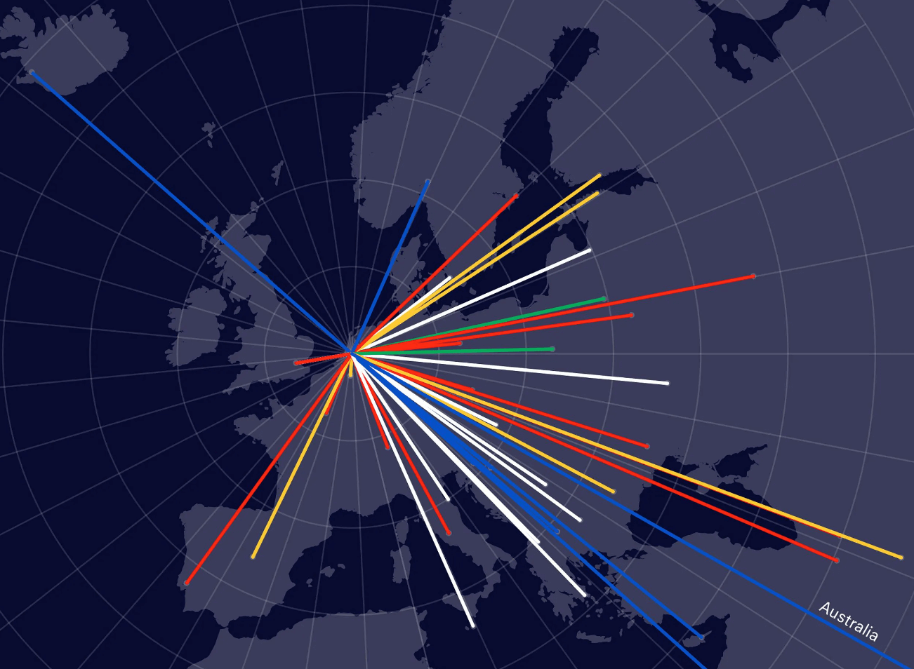
2021/2020
Open Up – Rotterdam, Netherlands
The 2021 brand identity was designed by CLEVER°FRANKE, a ‘data design and technology consultancy’ headquartered in Utrecht, in the Netherlands.
The concept they developed for the 2021 Eurovision Song Contest was a data-driven visualisation of all participating countries, using bespoke software.
CLEVER°FRANKE designed an abstract representation of all the countries coming together by taking two colours from the flag of each participating country, and plotting them onto a vignette.
The 2020 version could not go ahead due to Coronavirus restrictions, so the following year the concept was built-on and adapted. The 2021 version connects Rotterdam to the other participating cities, acting as the central point in the data visualisation. All other cities’ placement on the vignette refers to their relative geographical position and distance from the host city.
This brand concept played brilliantly into a moving identity, with strong applications across multiple digital mediums.
2019
Dare to Dream – Tel Aviv, Israel.
The 2019 Eurovision creative concept “Dare to Dream” was developed by Awesome, a creative brand & product company by Deloitte Digital, whilst the logo and identity was created by Studio Adam Feinberg (ST/AF).
The triangle theme used throughout the brand identity was inspired by that year’s stage design by Florian Wieder, one of the most famous stage designers for large TV productions, regularly designing the set for the ESC.
Israeli Host Broadcaster KAN said “The triangle, one of the world’s oldest shapes, is a cornerstone symbol found universally in art, music, cosmology and nature, representing connection and creativity. As the triangles join and combine, they become a new single entity reflecting the infinite stellar sky, as the stars of the future come together in Tel Aviv for the Eurovision Song Contest 2019.”