With version 2.2 due for release in early 2023, we’ve looked at what to expect from the new criteria, any changes from version 2.1, and how we can get ahead of the curve and start thinking about these now during product development.
What is WCAG?
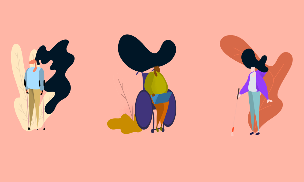
WCAG provides a set of specific criteria, organised according to principles, guidelines and success criteria, used to measure and improve the accessibility of web content. It sets the standard for how websites and other digital content should be made accessible and user-friendly for everyone, regardless of their disability or impairment.
WCAG has announced a new and improved list of success criteria – WCAG 2.2, due in the coming months. These updates will help improve the following areas:
- The use of a keyboard
- Avoiding reliance on dragging movements
- Ensuring controls are sufficiently spaced out
- Displaying help mechanisms consistently across websites
- Letting users authenticate without cognitive tests
- Avoid asking for repeated information
Before diving into the details, it’s important to note WCAG grades its criteria with certain levels of conformance:
A (Single A)
The minimum level of requirement all websites, apps, and digital content such as documents should follow.
AA (Double A)
Includes all A and AA requirements and is the conformance level many businesses strive for. This is a hard requirement for .GOV services.
AAA (Triple A)
AAA compliance is the highest standard level of accessibility and includes all A, AA and AAA requirements, which provides everything for a completely accessible offering and makes up the difference between a good experience and an excellent one. It’s generally not considered a good idea to adopt this as a general policy as some content cannot reach this level of conformance, but there is no harm in aiming for this level in some success criteria.
What criteria can you expect?
Focus: better experience for keyboard navigation
The requirement level for focus visibility and appearance has become more strict; here’s what to expect:
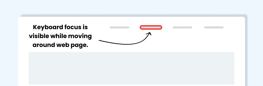
- Focus visible (A):This criteria has been promoted from level AA to A, requiring interactive elements that can receive keyboard focus to have that focus be visible.This is great, as it means that it will be a minimum requirement to ensure that people that rely on keyboard navigation to know where they are on a page.
- Focus appearance (AA): Visible focus states for keyboards need to be clearer and meet AA standards. This criteria revolves around focus states having more contrast between their unfocused states and any background elements.
- Focus not obscured (AA/AAA): We’ve all probably seen sticky elements on a site for example cookie banners, sticky navigation/headers. Whilst they can be a useful user experience feature they can create issues for people navigating via keyboard. The issue arises when the focus state of an element is blocked by user generated content that is sticky.
These new success criteria aim to deal with focus states being full blocked (AA) or partially blocked (AAA). As with the previous two criteria, this is another aimed at helping make sure focus states are always clearly visible to people who rely on them to navigate a page.
Filling out forms/repeated information
Filling in forms can be a stressful experience for users with accessibility needs; here’s what to expect:
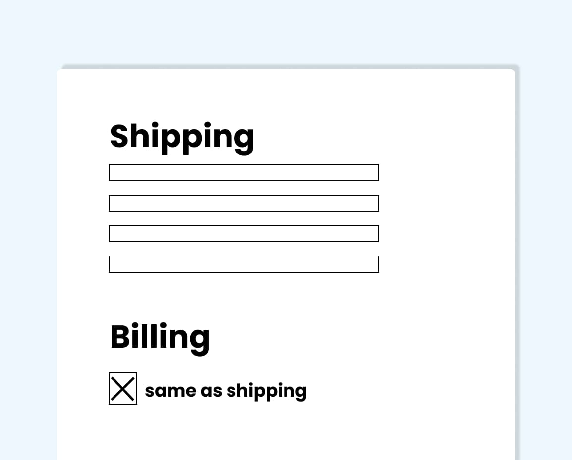
- Redundant entry: Allowing auto-fill to fill in forms should not obstruct any validation and make the journey flow more smoothly. This can be as simple as making sure billing and shipping address can be the same by ticking a box to say ‘yes, use it again’.
- Accessible authentication: Cognitive function tests, such as solving puzzles and remembering passwords, are not accessible. To achieve AA status there needs to be a way for someone to authenticate who they are without needing to take cognitive function tests.
Predictability
Creating accessible journeys is vital to making websites user-friendly; here’s what to expect:
- Consistent help: As a minimum requirement, users should be able to find help quickly and consistently throughout their entire journey. This includes ensuring support contact details are in the same place on each page and aren’t moving around or changing.
Input assistance
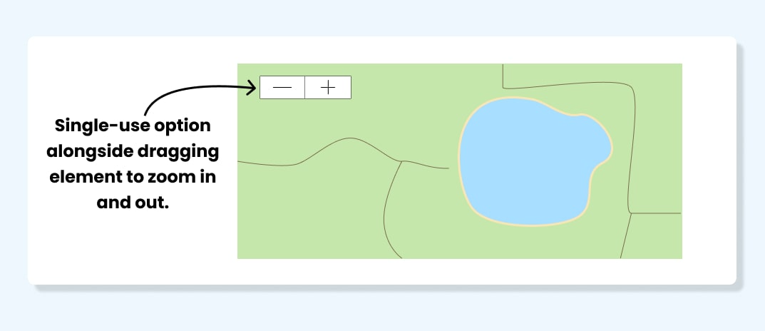
- Dragging movements: These have to meet AA standards. When navigating maps or price range sliders, there needs to be an alternative single-use option, such as a button, for those with mobility conditions.
- Target size: Making the size of any icons and buttons meet the minimum AA requirement will help people with less coordination. The minimum AA requirement is 24px by 24px.
How do you implement it?
These new guidelines are expected to take time to implement, but there’s absolutely no harm in getting ahead of the curve.
However, the earlier these criteria can be considered during the design and build of products, the easier they are to implement. Flagging any necessary changes early will help drive accessibility more effectively.
…
Want to learn more? Accessibility needs all of us, and a great way to participate is by continuously learning and sharing your knowledge. Read our beginner’s guide to accessibility to learn more about getting started with digital accessibility or watch our full breakdown of the upcoming WCAG 2.2 changes.


