Instant recognition. It’s the holy grail for any brand. After all, what could be more satisfying than a consumer knowing exactly who you are in a split second – from a glimpse of your logo or a flash of your packaging?
Strong branding takes consumers straight to you. And nothing gets them there quicker than your brand colours. You know how it works. You see a purple chocolate bar and know it's Cadbury's. That pink packet of crisps? Prawn cocktail, obviously. This is the power of colour in branding. So let's get into the nitty-gritty of why certain brand colours work.
 https://www.flickr.com/photos/diliff/11206258994
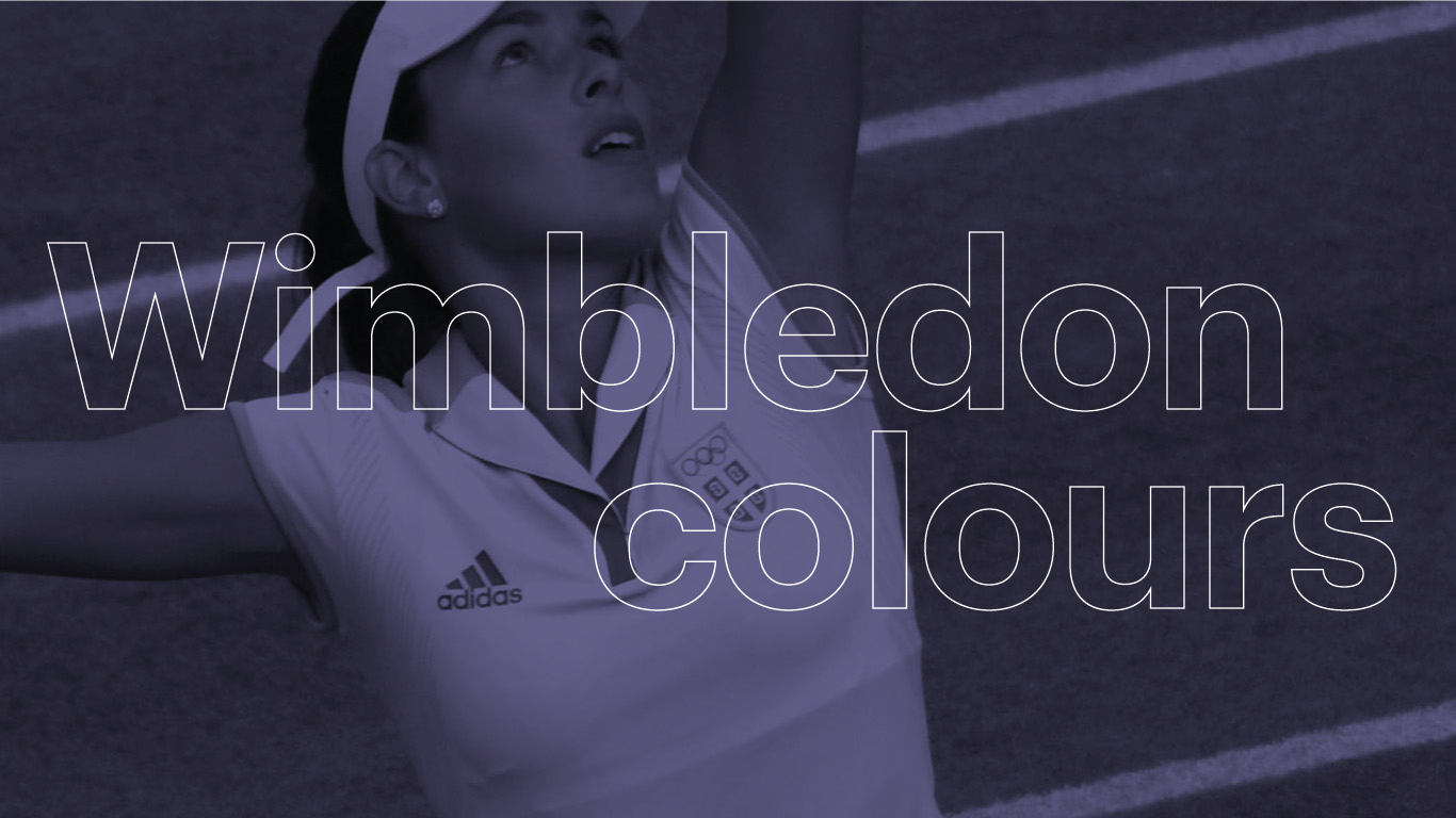
Refreshed branding to revitalise a sporting icon
Over the last couple of weeks, Wimbledon has served up some amazing tennis – not to mention 190,900 portions of strawberries and cream! The tournament is a British icon. And its branding is recognised globally. But how did they come up with their palette? And what does it stand for?
You don’t need us to tell you what Wimbledon’s brand colours are. Purple and green are everywhere. From ticketing and signage to marketing and merch. But a few years ago, the All England Tennis Club (AETC) – the organisation in charge of the tournament – made the decision to give Wimbledon’s brand an update.
They knew the brand had challenges. Its image felt slightly old fashioned and the tone of voice out dated. Of course, the AETC didn’t want to lose Wimbledon’s heritage. They understood that consistency was key. But they knew the brand needed to evolve. Blending tradition with modernity was a tricky balancing act. So they worked with The Clearing, a branding strategy company, to evolve what the brand looked like and how they spoke. They wanted to bring the brand to life in a new way.
The brand colours picked in 1909 weren’t up for discussion. And why should they be? They’re part of Wimbledon’s DNA. They had to stay for the sake of continuity and reassurance. So how could the brand colours be moved on? The refresh brought In a flash of white to modernise the look and feel. And stripes were introduced to create consistent visual impact. Anyone involved with creating materials for the brand has the AETC’s brand guidelines to lead them.
Join Manchester Digital and Dawn Creative on the 16th of November 2022!
Click the image to book on:

What’s the story behind Wimbledon’s brand colours?
Purple and green have been Wimbledon’s colours for over a century. Before this, they used blue, yellow, red and green – but discovered that this combination was almost identical to colours used by the Royal Marines. Around this time, Wimbledon was becoming more prominent. It wasn’t just part of the English summer season – it was growing on the international sporting calendar. The time was right to refresh the brand.
But why purple and green? There’s nothing in the Club records to explain what was behind the decision. But we can have a pretty good guess. Green suggests nature and outdoors, right? Healthy and wholesome – just like tennis. And purple feels regal, luxurious and exclusive. They’re an unusual combination. But who’s to argue? They perfectly sum up what Wimbledon stands for. Purple and green have become Wimbledon’s ownable brand colour combination. And it’s known globally, by tennis fans and casual onlookers.
But why add white? Just think about it – it’s another colour synonymous with Wimbledon. The AETC have remained consistent in their ask: Players must wear white. The reason behind this is that in the 19th century, when tennis became popular, being seen to sweat was regarded as unseemly. White disguises perspiration much better than other colours. Simple, when you know!
So why are colours so crucial?
How you use brand colour depends on your industry. Colour can be an identifier – this means that brand and colour are pretty much inseparable. In the world of fast food, everyone knows what yellow and red stand for: They take you straight to the Golden Arches.
For companies focused on trends, however, consistent brand colours can be less important. One minute green’s big. The next you wouldn’t be seen dead in it. So their brand colours change and evolve along with fashions, keeping the company bang up to date.
And have you noticed that some clothing retailers avoid colour and go for neutrals, like black, white and grey? There’s a logical reason for this. And that’s to provide a versatile, consistent and unobtrusive backdrop for shifting trends.
What do colours mean in branding?
Different colours make you feel different things. Of course, this depends on how they’re used – but there are a few generalisations:
- Red - Passion, anger and excitement.
- Yellow - Happiness, creativity and hope.
- Orange - Playfulness, vitality and friendliness.
- Green - Stability, prosperity, growth and connection to nature.
- Light blue - trust, openness, innocence and tranquillity.
- Dark blue - professionalism, formality and security.
- Purple - Royalty, creativity and luxury.
- Brown - rugged, earthy and traditional.
- Pink - youth, innocence and femininity.
- White - cleanliness, simplicity and health.
- Grey - neutral, but can be subdued, serious, classic or mysterious depending on the shade.
- Black - sophisticated, luxurious and edgy.
How many brand colours should you have?
In the world of branding, colours can be broken down into primary and secondary. Primary brand colours are your consistent colours. Like Coca-Cola’s red – used across all marketing materials, digital and print, packaging and social channels. Secondary colours complement your main colours but can be updated and changed – evolving with your goals or aims.
As with most things, less is usually more. Aim for two contrasting but complementary primary brand colours – but no more than three. And pick four or five secondary colours, which can be used as and when you need them.
Help! How do we pick colours for our brand?
Knowing where to start can be confusing. But let’s take it back to basics. What image do you want your brand to have? What values do your customers identify with? What might appeal to them?
Your visual brand identity can tell a story. After all, the colours you’ll pick for a children’s play centre are going to be very different to those you’d choose to brand an upmarket gent’s tailoring business.
As we’ve already said, colours work in marketing to get us feeling things. But don’t just take our word for it. The neuroscientist, Antonio Damasio believes that how a consumer feels about a brand has more influence than they think. So don’t ignore what you know about the effect of certain colours on emotions. Picking the right one for your brand could be the difference between boom or bust.
Ready to choose your brand colours? Keep three things in mind. Think positioning. Think brand values. Think overall strategy. This will give you a clear idea of what you’re wanting to achieve. And ultimately, help you choose your perfect brand colours.
 Taken from Dawn Creative's Brand Strategy Guide
Colour theory: Here’s the science bit
We’ve already touched on the link between colour and emotion. Colour theory explores this in more depth. It’s the guiding principle, which designers use to pick the right colour scheme to get the message across. Anywhere your customer sees your brand, your colours will be used there. Emails, marketing materials, websites, social media and more.
But how do designers know which your best colours are? They use a colour wheel along with extensive, collected knowledge about psychology, cultural assumptions and optical ability. Take a hospital, for example. Whites and blues are often used because we know that these tones create feelings of calm.
Your brand colours speak volumes – without saying a word. Your customer is more likely to respond if your brand colour makes them feel a certain way, meets their values or suggests that you can solve their problem. Want to inspire or energise? Think red, yellows and oranges. Want to reassure or comfort? Try light blue. Connect with your customer on an emotional level. Find out what they want from your product or service. And let your brand colour speak their language.
Colours make brands consistent. Make brand messages stand out. Make us feel things. Create positive associations. All this and more, to help foster, build and maintain brand loyalty.
Change brand colours, impact brand identity
Colour is your super power when it comes to brand perception. So picking the right colour palette is a decision that needs careful thought.
But what if you want to change your brand colours? If you’re an established brand, with a recognised set of brand colours, making a change can be tricky. Balance any potential rewards with the degree of risk.
Marketing underperforming? Not reaching your target audience? Re-branding with new brand colours could be just what you need.
Business taking a new direction? Signalling it with a change of brand colours could get the message across.
But that’s not the end of it. What will new brand colours say to existing customers? Something similar or completely different? Is this a brand evolution or revolution?
If your marketing is consistently failing, maybe you’ve got nothing to lose by changing your brand colours. But it’s not always this clear cut. It could be worth trying other strategies before recolouring your logo.
What are the most popular brand colours?
Fashions in brand colours come and go. According to a 2018 analysis of the world’s top 100 brands by Adobe, the most popular brand colours were blue, red and black or greyscale. Blue was used by a third of all of the top brands. And top brands only used one or two colours. Keeping their brand identity simple and easy to recognise.
Looking for a hard and fast rule to guide your brand colours? The bad news is that there isn’t one. There’s no ‘one size fits all’. By all means check out your competitors – but ultimately, the choice is yours.
First and foremost, get clear about your brand and what you’re hoping to achieve. This will help you make your decision. You’re looking for brand colours that communicate your values and positioning. You need a palette that supports your brand strategy.
What brand colours are trademarked?
We can all think of brands which have claimed colours as their own. White for Apple. Red and yellow for McDonald’s. Recognising how distinctive and powerful their brand colours are, some companies have protected theirs through trademarking.
Some of the most famous brands to do this include:
- Tiffany Blue - a distinctive egg-shell blue associated with the jewellery designer, Tiffany & Co.
- John Deere Yellow & Green - the maker of tractors, garden and agricultural equipment John Deere have trademarked its iconic yellow and green combination.
- 3M Purple - the office supplies company 3M has trademark rights over certain shades of purple when used for certain purposes.
- Cadbury Purple - another attempt to claim purple is Cadbury who have found it more challenging to assert its rights over the popular branding colour.
- Fiskars Orange - Fiskars who make scissors, knives and tools have trademarked the distinctive orange used for handles on some of their equipment.
- Wimbledon Purple & Green - The All England Tennis Club has established that the colours purple and green are an integral part of the Wimbledon brand.
When it comes to brand colours, Is it good to stand out?
Let’s go back to Wimbledon as an example. Underpinned by its USPs of heritage and longevity – and their distinctive branding sets it apart from other international tennis tournaments. Some have gone down a more corporate, colourful or contemporary route – but Wimbledon has stayed true to its traditional roots.
So what does this mean in terms of its brand colours? They’ve stuck with their purple and green, retaining a strong visual identity for over a century – giving it a modern twist with the flash of white. This simple ‘tweak’ has freed Wimbledon from any negative connotations of being an old and out dated. Who knows what was behind the AETC’s original colour choices. It doesn’t really matter now. What’s important is how recognisable the brand colours are today. It’s a brand that stands out.
So yes, you could say that there is an advantage in being different. This also works if you’re a disruptive brand. One that wants to do things differently and set new rules. You may not compete on price or familiarity – but you sure can grab attention. This is your big chance to break the mould!
How can Dawn Creative help?
Think your brand needs a bit of what Wimbledon has got? Feel like your brand colours aren’t speaking your customer’s language? That’s where Dawn Creative can help.
We’ll get the heart of your proposition and your values, to help you choose branding colours as part of your overall brand identity and strategy.
Find out more about how we work and what we can do for your brand contact us today.