How can you improve your web design in a few easy steps? If you’re looking for ways to clean up your site and bring it up-to-date in a way that will encourage conversion rates and longer session times, here’s how to do it.
Regularly break up copy with graphics
It’s easy to forget that your user will not be as interested in the copy you include on your site as you are, and whilst you may have spent a lot of time and effort writing in-depth content that goes into great detail about your business, people are likely to switch off when faced with a daunting page full of text. This is a prime example of the importance of graphic design, and is the first simple hack that every single website design should reflect.
Make sure that your copy is regularly split up by relevant graphic design elements. Keeping copy to bite-size chunks helps them to be more digestible to your audience and in turn will get your message across a lot more clearly than had you included thousands of words. Here’s some examples of graphic design elements you could use to split up copy…
- Web banners
- Imagery
- Infographics
- Charts
- Galleries
Include white space
White space is the area of empty space that lies between your design elements, and it’s really important to have it because it makes your site look more visually appealing. An overly busy site will confuse the viewer and ultimately make it harder for them to complete a conversion event.
Whilst it may be tempting to fill up your page with lots of different design elements and copy, remember that white space is a good thing and there should be plenty of it on your web design. Modern web design uses lots of space to draw more attention to key areas of a site. For example, making sure that your copy is displayed on a crisp white background helps make it easier to read which in turn will make your site more user friendly. Ensuring there is adequate space between a graphic design element like imagery and a title will help to move the viewers eye across the page and consider each element easily.

Choose a contrasting colour for your CTA buttons
What can you do to ensure that your CTA (or call-to-action) button is as engaging as possible? CTA’s range in uses from add to carts to downloads, but there is one thing you should implement across each of your buttons which will help them to be noticed. Your CTA buttons should always be a somewhat contrasting colour to the rest of your site. In order to determine the best contrasting colour combinations it’s useful to have a knowledge of the colour wheel, but here’s some examples to give you some inspiration:
- Orange is contrasting to blue
- Yellow is contrasting to purple
- Red is contrasting to green
This simple hack is going to help your users rapidly identify the areas on your site in which they can take action and receive the product or service they need. Making sure your call-to-actions are visible by using contrasting colours is the equivalent of highlighting the answers in a text book – you can see obviously the key points that you need even in a sea of other content.
Bonus tip: When you start to use colours primarily for actions on your site, you can use the association between colour and action in other areas of your marketing too. For example if your buy now button is green, use the same colour on your retargeting ads to help create strong and recognisable branding.
Use icons to communicate a message quickly
Iconography is something that a graphic designer will often use to convey a message in an interactive, simple way on a landing page. For some examples, why not try some of the following….
Do you have a process that each customer will need to go through with your business? Instead of using a heavy amount of text on the page, try splitting up the process into a few steps and highlighting each smaller chunk of content with a relevant icon. This will help the customer to see what the process involves at a glance.
Use icons to display the key features of your service – Remember you have under 15 seconds to grab the users attention on the web page.So whilst lots of imagery is important, having icons included to outline the key features of your product or service is the perfect way to let the user know what you do instantly.
Bear in mind that icons should be minimal in design and illustrate a point in a relatively uncomplicated vector so as to reap the best results from their use in your web design.
![]()
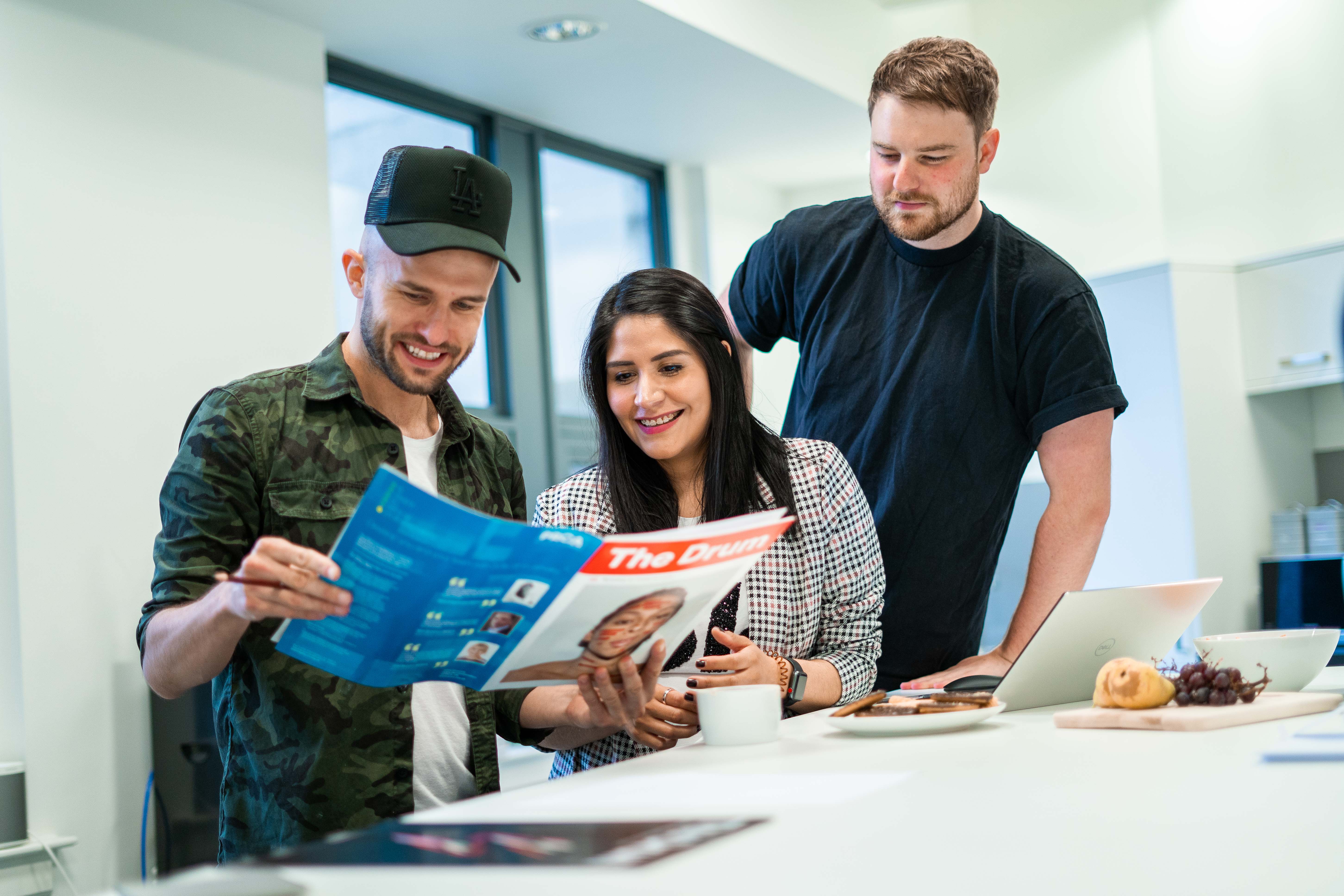
Use unique imagery and fonts
In 2021, more and more people want to connect to the brands that they purchase from. That means that, on the whole, companies have some work to do in terms of making their brands more transparent and human. For years professional meant perfectly edited stock images and overly polished copy, but now people connect more with the brands that reach out to them in a personal way.
One easy way to start practicing this in your business is to include real imagery wherever you can. Template design is becoming more and more obvious as lots of businesses adopt this way of accessing graphic design, but unfortunately with the increase comes a general recognition of overly-used stock images and fonts. What effect can this have on your web design? Today marketing is harder simply because each and every industry is saturated with people vying for top spot, but you will make it harder for your business by using fonts and imagery that blend in with your competitors. Instead, use highly relevant pictures and unique imagery wherever possible. Whilst free stock photography sites are valuable tools for designing on a budget, time still costs money and is better spent creating graphics that will really work to set your business apart from the rest.
In this blog, we’ve discussed five super simple hacks you can implement in your web design to leverage your site and help it start getting better results. If your site hasn’t been updated in a while or conversion rates aren’t what you think they should be, the chances are it could be down to poor quality web design. If you want professional help from a UK-based graphic designer, get in touch today and we would be more than happy to help! And if you think this blog would be helpful to someone you know, we always really appreciate the share.