Research suggests that many autistic people feel the most comfortable online, which results in a high representation of autistic online users who socialise, shop and learn frequently.
So, how can we ensure that websites and apps are inclusive for those with Autism Spectrum Disorder (ASD)?
To help raise awareness for World Autism Acceptance Week, here are 7 things to consider when designing for autism:
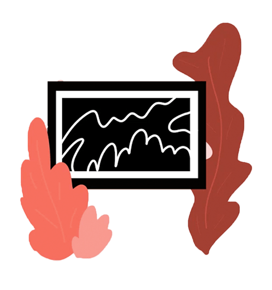
1. Imagery
- Use visual cues such as pictures or icons to illustrate a concept and help with reading comprehension.
- Simple graphics in colour have been found to be very effective, however, visuals should not overlay text as it can be distracting.
- Visuals, icons and graphics should only be used to support or explain text further, or to provide information that text alone can not achieve.

2. Text
- Text is best placed separately from other page content. This allows readers to fully process the text and not get distracted by other content.
- Sticking to ‘plain’ language can make it easier for people with ASD to understand the context and the inferred meaning.
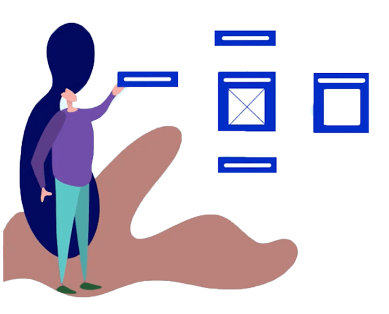
3. Layout
- Rapidly changing information can be overwhelming for people with ASD due to overstimulation.
- Layouts should follow a simple and clear structure and avoid any unnecessary elements of movement and animation.
4. Colour
- Use muted colours such as brown, beige and grey.
- People with ASD have a significantly lower preference for brighter colours such as red and yellow in comparison to people without ASD.
- Brighter colours have a higher luminance value, which could be the reason for the lower tolerance and people with ASD often have hypersensitivity and are prone to sensory overload.
5. Metaphors
- ASD people can be extremely proficient in understanding information as a whole.
- However, it can be difficult for them to understand inferred meaning in language and social settings.
- Use ‘plain’ language to make it easier for people with ASD to understand the context and the inferred meaning.
- Iconography should always, in most cases, be used in combination with labels – except in cases such as back buttons which are commonly known.
6. Navigation
- Reducing the number of toolbars to just one and using large, descriptive labels for buttons in combination with icons can also help.
- Progress bars should be incorporated as well to provide a sense of structure.
7. Interaction
- It is suggested to only use animation and transitions if they add an additional benefit and are not used for purely visual effects.
- Horizontal scrolling can also be unpleasant for autistic users. Elements on a page which do not show the entire content and are hard to control are distracting and uncomfortable to use for people with ASD.
- Avoid using animated banners, autoplay ads and pop-ups, as this can cause anxiety for people with ASD.
. . .
See the links below for further reading on designing for autism:
Connecting with the Autism Spectrum
The Pattern Seekers – Simon Baron-Cohen
‘Autism Friendly Digital World’, Living Autism, 2019, Lisa McNair
‘Usability Testing with People on the Autism Spectrum: What to Expect’